Responsive Redesign
For years I monitored analytics for our site and watched our users start to use our site on their phones. This was surprising as only a few years earlier many of our visitors were still on dial-up. I did research, explored ideas, and developed a plan for how Fish, Wildlife & Parks would deal with their growing mobile audience. It was decided to go responsive for several reasons:
- The site was approximately 2000 pages, maintained by 2 people. Responsive design allowed us to maintain one set of code and content, which was much more feasible considering our staff size.
- The responsive site allowed our audience to see the same content everywhere. Although it rearranges a bit on different screen sizes, there's still a lot of consistency.
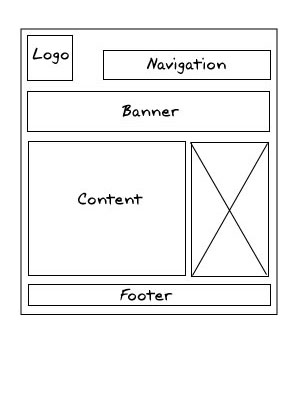
Just before the launch, I did training with our front-line personnel throughout the state. Most of them were new to responsive design, so they needed understand how the site would change on different screen sizes. This was imperative as most were accustomed to telling customers (over the phone) to go to certain areas of the screen and staff needed to understand that things could be arranged differently if the visitor were on a phone.


