Cheryl Aldrich

More Work

Aging Adult Monitor

Aging Adult Monitor Project

The Aging Adult Monitor is a system that helps family caregivers monitor the health and safety of their aging loved ones. It consists of a wristband worn by the aging adult and an app (and website) used primarily by the caregivers to monitor their loved ones. The wristband collects information about vitals, activities, location, emergencies, and alerts, all of which can be monitored via the app. The system also provides communication between the aging adult and loved ones as well as emergency staff, when necessary. Medications and health history information are stored on the system so it can be readily available in case of an emergency.

Research

The goal of the research was to get a clearer picture of the concerns that caregivers have about their aging loved ones and those things that would give them peace of mind.


Research - Concerns

Personas and Empathy Maps

There are three basic types of caregivers who would use this app:

  • Charlie: Parents live with this caregiver so he is very knowledgable about their conditions. His ultimate goal is to keep his parents at home where he can take care of them himself.
  • Mary: She cares about keeping her parents safe and healthy, but does not have the means to have them live with her or to care for them full-time. She wants to monitor them to ensure they are safe and healthy and to know when something needs her attention.
  • Tiffany: She has a busy life so she can't be there as frequently as she would like. She isn't real concerned about her parents at this time, but the abilty to monitor them gives her peace of mind. If the day comes that she feels they aren't safe or healthy she will look into other solutions for their care.

View the personas and empathy maps for each of these personas: (I'm trying to recover personas from Xtensio. I hope to have them back very soon; otherwise I'll have to redraw them. July 9, 2018)

Personas and Empathy Maps

Wireframes and User Flows

Throughout this process I received feedback about this project from the Springboard Community and others. This information, as well as my previous experience, led to several decisions about the design used in the wireframes.


Wireframes

Prototype

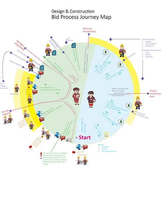
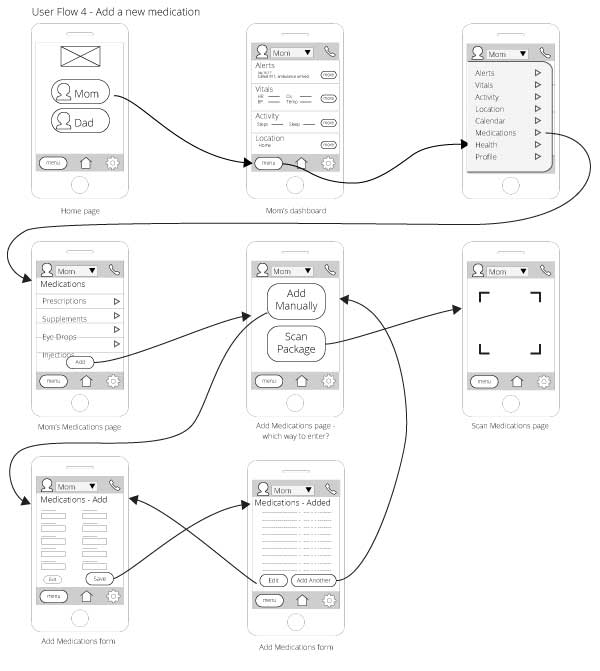
I created the propotype using InVision. It was created using an iPhone 6 template. I have used Axure in the past for prototypes, but chose to try a new tool this time. It's always good to learn tools and then you can choose which fits best for each situation.

I expanded on my wireframes and applied comments I received throughout the process to the prototype. It's a big system so I did not implement all functionality. I attempted to capture as much of the high-level functionality as I could in order to give a user a pretty good idea of what's available and how to navigate around the app.

Some considerations that went into the design of this prototype:

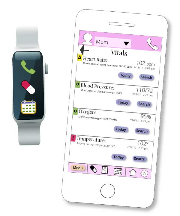
Aging Adult Customization

It is possible to customize each aging adult in a couple of visual ways so there’s never any confusion about who’s information one is viewing.

  • The header and footer match the color for the Aging Adult
  • There’s a profile image in the header
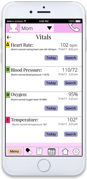
Priority Coding

As there are many pieces of the app that have varying levels of importance, I used a pretty standard red - yellow - green to identify the levels.

  • Red - emergencies
  • Yellow - warnings
  • Green - general, normal

ADA

I always try to consider any ADA issues that I can possibly accommodate. Various forms of color blindness and other visual difficulties are always a top priority. If you design for people with visual impairments of any kind you are sure to end up with a UI that everyone can view easily.

To make the priority coding work even for people with color blindness I also added a symbol for each level so that even if one cannot to distinguish the colors, they symbols are there to help them also.

As the header and footer are color coded for the specific aging adult, which some might not be able to see, there are 2 other ways to know who you are looking at:

  • their profile image in the header
  • their name in the header

Medical Information

I found someone with a medical background who helped me with terminology and important medical information. I want to be sure that people understand enough about entering health and medications so that they don’t accidentally omit important information. As aging adults are frequently on many medications, drug interactions are a very real concern. In an emergency, medical staff also needs to know a lot of medical history, many things that many people might not think important. I didn’t take the prototype far enough to enter all medical information, but I did gather very important information about exactly what I would truly need to capture.

Usability Testing

Usability testing was very informative. I found volunteers with varying levels of mobile app experience. There were a few surprises which led to a few tweaks to the prototype.

Share vs. Send

There's a feature that allows one to send medical and medications information to medical staff. At first, I labeled the button "Share," but one of my younger testers told me that he associated the word "share" with social media so he would be very hesitant to click the button. It is very common to see the ability to "share" many types of content these days so I thought that "share" was an appropriate word. Even though only one person made this observation and I was following a current trend, I thought it a worthy observation and I found that I could use the word "sSend" instead with no loss in meaning. So why not be more clear and avoid possible confusion.

I changed the button name to "Send."

Dashboard vs. Menu

The intent of the dashboard is to show information that caregivers want to monitor frequently. It contains dynamic data which could indicate an issue or possibly an emergency. I wanted to keep the dashboard as simple and clean as possible to make digesting the data as quick and easy as possible. Information about health history and medications is static and would have cluttered the dashboard, hence that information was relegated to the menu.

People quickly understood the dashboard, but then hesitated to use the menu. They seemed to think they could find everything there. People saw the menu button, but were hesitant to use it. I had to help a few people find the health information for that testing scenario. After the usabilty test was complete, I asked everyone if they had any issues with the health information being in the menu, now that they knew where it was. They all agreed it made sense being in the menu.

I decided that I would create a quick tutorial for the app for first time users. That would solve this issue and also help familiarize people with the many features the app has to offer.